written by Jowita Mróz (18.06.2020)
translated by Jowita Mróz (15.11.2020)
Paradoxically, in the conditions of a centrally planned economy (a command economy) and in the face of limited accessibility of goods and their low differentiation, advertising of products and companies was a phenomenon not only extremely popular in the Polish People’s Republic, but also was playing a much more complex role than building a political and propaganda message. Advertising poster, murals and other types of utility graphics added colour and enlivened grey and stifling reality of communist Poland. And more importantly, they shaped the visual culture, which turned out to be more sustained than the political and social context of its formation.
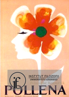
Advertising did not have to be aggressive, subordinated to market research and restrictive rules of a free market competition. That provided the artists with a certain freedom in implementing their projects. However, the possibility of creative and original advertising of products was quite a challenge. How to create some poster advertising a company producing cosmetics and household chemicals in an attractive way for customers and principals, without losing one’s own style? In the 1970s Karol Śliwka answered this question more than once. Let’s take a look at how he completed his task by designing the poster of the “Pollena” Union (Zjednoczony Przemysł Chemii Gospodarczej “Pollena”).
In Śliwka’s characteristic way, the “Pollena” poster combines simplicity of the sign and symbol with interpretive and visual ambiguity that awakens viewer’s imagination. Poetic permeation of the main elements of the poster – the flower’s crown becomes a hairstyle, the bird (depends on your interpretation) becomes eyelashes, the stalk appears as a slender neck – is not only a subtle play with viewer’s visual perception, but also an interesting reference to the tradition of surrealism. Mild shapes and pastel tone of the background send an unobtrusive message about the quality of the Pollena’s products – they are delicate and natural, using them adds beauty. Still, there is no monotony in Śliwka’s poster. Gentleness is broken with juicy and warm colours that capture viewer’s attention and fit into the Pollena’s promotional strategy. The selection of natural motives with which Śliwka is playing – in his own special way – is not a coincidence. It is a visual, based on game of associations, information about the company, but also – in a larger context – it refers to common belief in value of native products due to their natural and organic character.
This specific play with familiar shapes appears also in Śliwka’s other works. It is worth to mention some of the earlier ones: the humorous advertising brochures for the “Varmiex” company (the 1960s), the leather goods’ sign “Piggy” (1968), the “Centromer” poster (around 1970) or the advertising poster “Smyk. Dom towarowy zaprasza” (1976)1.
1 These works were collected in the monograph Karol Śliwka published by the Gdynia City Museum, ed. Agata Abramowicz, Agnieszka Drączkowska, Jacek Friedrich, Patryk Hardziej, the Gdynia City Museum, Gdynia 2019. They are also available on the artist’s website: www.karolsliwka.pl/index.htm.
